I’ve had so many little UI niggles lately I though I’d finally use my developer account and jump into the beta on my iPad and iPhone.
So far I’ve only really noticed a couple of things.

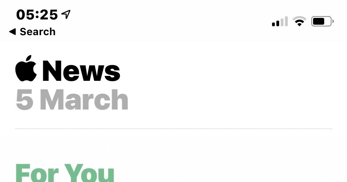
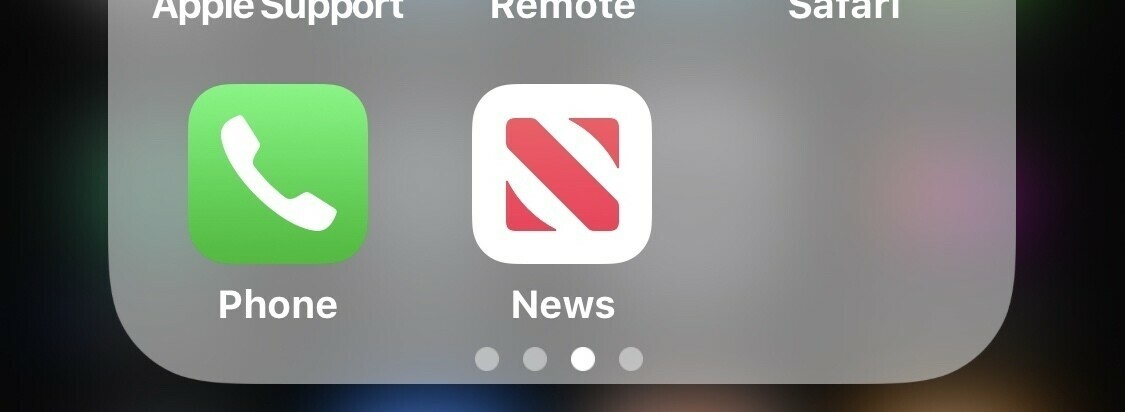
News got an Apple logo instead of the company name, it also got a new app icon.

I’m not sure what to think about this one, it doesn’t really say News to me. I don’t think I like it.
Secondly even though it’ll be logging more information at an OS level it seems snappier than the public release. Where I notice it most is in app switching.
Here’s a post on all the changes, my one is about things I’ve personally found when using it.